overview.
This project consisted in designing a travel booking app by trying as many visual iterations as possible. I worked with an already existing persona and parted from the information given to craft a problem statement. I then built a user flow by outlining the steps the user takes in order to finish her task. This allowed me to ideate and sketch out some low-fidelity and mid-fidelity prototypes. After running user tests on them, I made changes to the designs and built a high-fidelity prototype. I tried several color palettes and for my final design, I ended up using the most accessible one. The final deliverables included an interactive high-fidelity protoype and a product presentation.
tools.
Benchmark Analysis
User Flow
Crazy 8s
Wireframes
Prototypes
Usability Test
Sketch
Invision
role.
I was the only participant in the project. I defined problem, ideated solutions, tested and reiterated on the different prototypes.
the project.
1. I crafted a problem Statement based on a given user persona.
"Young work travellers who feel overwhelmed by logistics need a way to stay organized so that they can easily access their travel documents."
2. Based on that information, I outlined the main insights and their solutions.
3. I built a user flow by noting everything the user saw and the steps they took.
4. I worked on low fidelity and high fidelity prototypes. I ran usability tests, pinpointed the areas that needed improvement and made changes accordingly.
5. I tried several color palettes and made variations on them until I reached an accessible combination.
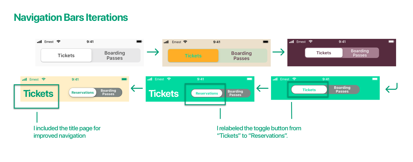
6. I iterated on several elements of my design based on the results of my usability tests.


Read the complete case study on Medium