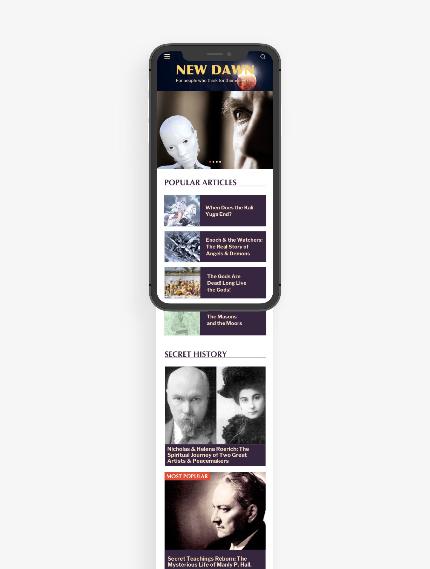
overview.
My team and I worked on redesigning the editorial website, New Dawn, a magazine based in Australia. We carried out research based on the already existing site by using tools as card sorting and content audits. We proceeded to sketch several new ideas and to prototype. Finally we created a responsive version of our site by using HTML and CSS. The final deliverables included high fidelity prototypes of the homepage, a section page and an article page, a mobile high fidelity prototype of the homepage, and the HTML and CSS codes.
tools.
Content Audit
Card Sorting
Style Tiles
Wireframes
Prototypes
Sketch
HTML
CSS
role.
I participated in the research, ideation and testing, process along my teammates. I programmed the homepage in HTML and CSS.
the project.
1. We carried out a content audit and card sorting tests to identify the weaknesses of the current design. We created a site map with the new page hierarchy.
2. We developed a concept for the site and its readership. We built a style tile around that.


3. We sketched mid fidelity and high fidelity prototypes until we reached a final result.
4. We ran usability tests and reiterated on our design based on the results. We focused on improving the visibility of the commercial sections, accesibility of the navigation bar and the differentiation between the side bar and the main content.
5. We created a responsive version of the homepage by programming in HTML and CSS.
Read the complete case study on Medium.